To exo spiti
visual identity
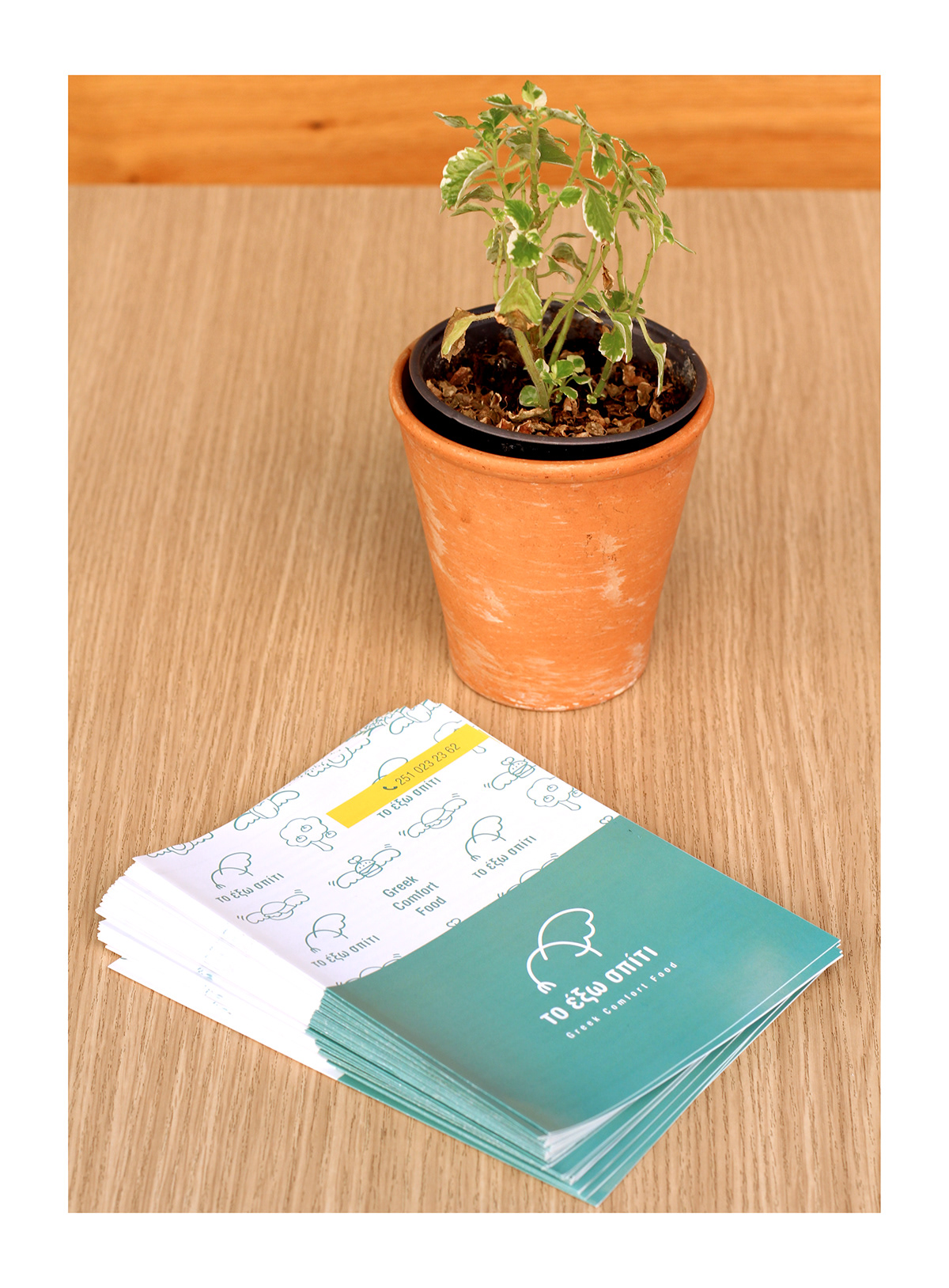
This logo illustrates the feeling of eating out with no guilt. We designed a fork hanging from a wing which makes it “light and free” from doing something wrong that we do not eat homemade food.
We used a font with rounded corners to emphasize the human hand.
The recommended colors are the green of olive or pink of skin in order to show the pure ingredients and the human character of the shop.
Applications
We decide to make the haven with a lot of light and free symbols


Thanks for watching...


